Categories
- Accessibility (4)
- Conferences (2)
- Food (1)
- Generating ideas (1)
- Good experience (3)
- Job advice (1)
- Mobile (1)
- Product Management (1)
- Productivity (1)
- Random words (1)
- Reviews (2)
- Site info (3)
- Stories (1)
published by Ben Allen
mint.com has over 4 million users. This popular online tool, which helps you manage your money across banks, has gone from startup to Intuit owned in 3 years. Clearly they are doing something right! I think the mint.com user interface is one of the things Mint is doing right. Let's take a little time to review.
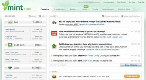
While mint.com is clearly sexier than your average banking related site there is one element of the UI that I think is wickedly clever. It's the humble "alerts space". Check out alerts on the mint site (update 26th Dec 2010 - they used to have a demo but it seems to have been axed).
In the day job, I've been working on how to sell products & services within a transactional website. It's not an easy problem because there are trade-offs at play. One must balance the following:
It's the age-old web-business-model-problem. How do you make ads unobtrusive but at the same time give them enough prominence that they stand a chance of being clicked? Or to put a "glass half full" spin on it - how do you let your users know about all the great stuff you & your ad partners offer while making the whole process enjoyable?
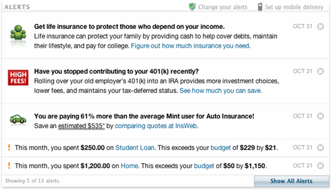
The alerts space is a great solution to the problem. Alerts in Mint are presented in the dashboard page, the first page you see after logging in, and are given plenty of prominence i.e., first thing in the second column, well above the page fold.
Alerts are a great tool for indicating key events in your finances. Mint users can configure alerts so that they are notified of different events - anything from low balances to ATM fees. Alerts can arrive as a text message or in your email but they will definitely show up in your web-based dashboard. The key point with alerts is - they have clear user value. User's want to keep an eye on their alerts because it makes their lives easier and can help them get their tasks done quicker. Alerts are a valuable feature.
There is more to alerts though. They are not just friendly notifications of financial events, they are also the home of super-powerful contextual sales messages.
Here is an example of the alerts space being used for sales:
Notice in this example I'm getting a little more than a notification of something that's happened within my bank accounts. There are alerts which are clearly trying to sell something... cue really cheesed-off customers... right? Well, maybe not. The alerts are still referring to my money and they are referring to events in my financial life, albeit indirectly. To put it another way these are sales messages but they are:
That's the magic then, the marketing special sauce. A feature which adds value to your customers but at the same time gives me a clear space to continue a conversation about the additional value of your service. You, the site owner, wins and your users win. Hooray!
It's easy to take things for granted. It's easy to accept the design of something without really looking at why you like it or why it was built that way. Part of the job of interface designers (IAs or graphical designers) is to understand the science of a particular design they like so that they can reproduce the desired effect in another design. If you're in charge of recruiting interface designers try asking them about their favourite website. Ask them why they think that site is successful and how the UI contributes to this success.
Mint contains many examples of clever contextual marketing but I cannot help wonder about other examples outside of Mint. The only one that springs to mind is Google and it's contextual ads. I search, they give me results, some of those results are paid for but that's fine providing they are contextual, relevant and helpful. What other examples are there that meet these 3 criteria? Add a comment if you can think of any!